Quote
JimYoungblood53
[attachment 5544 2020-06-05_2-53-17.jpg]
[attachment 5545 2020-06-05_2-54-47.jpg]
The one with the full curl looks better but it still looks "broken" to me. IMO, the 3d effect does NOT work on the helmet at all. Maybe if they made the dividing line thinner and don't separate the pieces could fix it. At least with the full curl, there is no longer a "crescent moon" or banana!! Just a goat horn on the top and a partial Rams horn on the side.
They defaced our ICONIC horn and replaced it with a 2 piece disaster. Oh well, they messed up the logo so they might as well mess up the uni too.
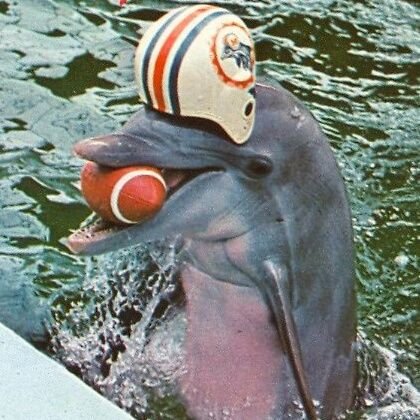
I hear they want to replace Rampage our mascot because he looks like a RAM. He will be replaced by a surfer dude who will ride a wave in a man made wave pool in the North end of the stadium every time we score a TD!! Just like the Dolphin who used to be in the Miami stadium!
Dolphin Mascot Flipper...
New Rams Mascot Reef...
#HelmetHornsMatter
“Well, the color is good, I like the metallic blue,” Youngblood recently said while laughing, via NFL Journal. “The horn is terrible. It looks like a ‘C.’ When I first saw it on the logo I honestly thought it was a Charger logo.
“Now when I see it on the helmet, it just isn’t a ram horn. There is no distinct curl like a mature ram horn. I don’t know how the Rams could get that wrong. That is your symbol and it has been for what? Seventy years or more? Longer than I have been alive? It’s just not us, it’s not the Rams.”---Mr. Ram Jack Youngblood


